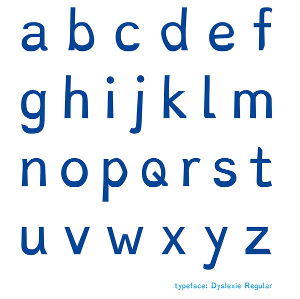
Dyslexie is a new typeface that was designed to make reading easier for people with dyslexia. It was created by a Dutch designer named Christian Boer, who has dyslexia. He understood that he had trouble discriminating between letters because most fonts are uniform; Boer designed a font with letters that are distinctive and, therefore, easier to tell apart.
Recently, Dyslexie became available for free download. Once downloaded, the font can be used for typing and reading on your computer, as well as for printing. Once you request your free download, you’re emailed a manual that tells you how to download the font to your particular system.
So is this new font really helpful? SUNY Cortland student Andy Hoffman thinks so:
Reading had always been a challenge for me. I often don’t read anything for long lengths of time just because I’m deciphering between words and often have to go back to reread something in order to understand its true meaning. I would often think that it is a disadvantage because it would take me twice as long to do homework as compared to someone else. The typeface on many fonts may look different but all have the same texture to them. They often don’t have differences between how they are written and, for someone who has dyslexia, it often creates problems.
I recently came around to this new font and started testing it out in various ways. I couldn’t believe the differences in text faces. It may be subtle but the texture of each word is framed in a way that makes it easier to make out each letter in a word. The subtle different between an I and J in a different font might be hard to come by but in this font, words that look similar now have a difference that is easier to make out. I highly recommend trying this font just for fun and see if it’s making a difference in your reading speed and understanding of the text.
Interested? Download Dyslexie for free here: http://www.dyslexiefont.com/en/order/home-use/